
Tuesday, 21 September 2010
Personal Work: Illustration
Just a bit of illustration from me. I am not an illustrator by nature but decided to give it a go. Here is a drawing I did before colouring it in in Adobe Illlustrator giving it a mosiac look. I colouredit in using the live paint bucket.

Personal Work: Moderate Drinking 2
I like the first moderate drinking add I did so much and got a good response from people so I decided to do another this time aimed more at men. I used the same techniques as previously.
View it below: (Click to enlarge)

View it below: (Click to enlarge)

Personal Work: Photography
I love photography and having got a new SLR camera I have been taking pictures whenever I get a chance. These are few I took over the holidays:


Personal Work: Poster Design
I was asked by the community centre church my mum works for to design for them a simple poster advertising their upcoming thanksgiving dinner.
They want the poster to have a original images but in a clip art style. The also required information about the dinner and event on the poster, as well as their address and the date of the event.
This is the final poster I designed for them that they decided on using: (Click to enlarge)
To create the images A few I drew by hand in Illustrator using the pen tool, others i got off the Internet and manipulated them to create a completely different look from the original. I also used live trace and the live paint bucket to help.
The hardest part was to get all the information onto the poster as I was limited to working at an A4 size. In the end I hand to compromise with them in terms of the amount of text that could be put onto the page along with the images. I cut away all the unnecessary text.
The centre was very pleased with the end product. I don't consider it my best or most artistic piece but it fit their requirements.
They want the poster to have a original images but in a clip art style. The also required information about the dinner and event on the poster, as well as their address and the date of the event.
This is the final poster I designed for them that they decided on using: (Click to enlarge)

To create the images A few I drew by hand in Illustrator using the pen tool, others i got off the Internet and manipulated them to create a completely different look from the original. I also used live trace and the live paint bucket to help.
The hardest part was to get all the information onto the poster as I was limited to working at an A4 size. In the end I hand to compromise with them in terms of the amount of text that could be put onto the page along with the images. I cut away all the unnecessary text.
The centre was very pleased with the end product. I don't consider it my best or most artistic piece but it fit their requirements.
Personal Work: Moderate Drinking
This is a poster advert I designed in my own time showing the perils of drinking beyond your limit.
I decided to do it in a cartoon-esque style so it wouldn't come across as too preachy and would be more friendly to my target audience of teenagers and young adults who consume alcohol.
 I designed it in illustrator entirely by freehand using the pen tool. I spent alot of time getting to learn about the pen tool and all its uses in my first year of university and was keen to get some more practise in. The lower bottom font "know your limits" was done by me by hand before being scanned in and vectorised.
I decided to do the font by hand as the uneven slope of the letters help suggest the drunkenness and disorder that comes with too much drink.
HUddersfield Town FC Project
This was our third and final conceptual design project. It was separated into different categories according to what stream we were studying. As I am in advertising my project was to come up with a headline and a sub-headline to announce the arrival of a new look Huddersfield Town FC mascot.
I also had to pick a graphic designer, illustrator and photographer who I would have work with me on the project. My commissioned artists can be seen below:
 I also needed to choose five influential football blogs that would carry my headline and sub-headline and the story about the new look Terry the Terrier, they are seen below:

This is the headline and sub-headline I submitted as my final piece:

Lastly I had to write a press release. I found this project interesting as it gave me an insight into my future job and I also found it challenging. I had plenty of fun doing. It confirmed to me that advertising is the right path for me.
I also had to pick a graphic designer, illustrator and photographer who I would have work with me on the project. My commissioned artists can be seen below:
 I also needed to choose five influential football blogs that would carry my headline and sub-headline and the story about the new look Terry the Terrier, they are seen below:
This is the headline and sub-headline I submitted as my final piece:

Lastly I had to write a press release. I found this project interesting as it gave me an insight into my future job and I also found it challenging. I had plenty of fun doing. It confirmed to me that advertising is the right path for me.
YorkShire Sculpture Park Project
This was our second conceptual design project. It revolved this time around The Yorkshire Sculpture Park. The purpose of this project was to establish a friendship scheme for the Yorkshire Sculpture Park that would benefit both it and its members.
Once again I worked in a group for this project with Sian, Jade, George and Fiona. We decided initially that our friendship scheme would be aimed at art student, however after a review we decided that our target audience should be families with young children.
Once that was decided we had to come up with products that members of the scheme would be interested in buying as well as designing a sketch book. Below is our final finished sketch book:


Our other product ideas included bags, posters and T-shirts.

The full explanation, thoughts and research and design processes can be found on the blog created for this project at http://team7ysp.blogspot.com/
This module felt fairly tedious as there was alot of research and constant to-ing and fro-ing when it came to designing our product and getting the ideas made and ready. The fact that all ideas had to then be shown and explained in a recorded presentation did not help.
Typography & Layout Design - Grid Systems
This module was entirely about modern grid systems. We had to find ten artistic examples that illustrated the modern grid system as well as 15 visual examples that illustrated good use of modern three dimensional grid systems.
Below is one of the artistic examples that I found:

The following is one of my visual examples of the modern three dimensional grid system in use:

We then had to design our own grid and find a location that matched the grid we designed as best as possible. Below was the grid I designed:

And this is my final piece the example I found that fit well into my grid: [example not uploaded due to blogger internal error]
Overall I found this module highly frustrating as there is so little information about the modern grid system and its uses, so it was very hard to get started. As a result I left this module undone until the last possible moment.
Wednesday, 9 June 2010
Intro To Digital - InDesign Final Piece
This is my final piece for the InDesign brief which stated that the piece must contain an example of a Photoshop manipulated image as well as a vector image done in Illustrator. (Click to enlarge):

I feel that this was not one of my best pieces of work but I was very pressed for time and had to complete the work as soon as I could. I am most pleased with the magazine pencil logo, the vector image done in Illustrator.

I feel that this was not one of my best pieces of work but I was very pressed for time and had to complete the work as soon as I could. I am most pleased with the magazine pencil logo, the vector image done in Illustrator.
Tuesday, 8 June 2010
Intro To Digital -Illustrator Final Piece
This is my final piece created in Illustrator. The brief stated that the word "vector" must be included in the design and that there was to be two fonts that we had created/designed. (Click to enlarge): Creating my own fonts was the hardest part of this design as i wanted it to be a bit different from other fonts found out there. So I would say that the font creation took the most time. The rest of this design was really simply done using the pen tool, gradients and plenty of colour.
 Creating my own fonts was the hardest part of this design as i wanted it to be a bit different from other fonts found out there. So I would say that the font creation took the most time. The rest of this design was really simply done using the pen tool, gradients and plenty of colour.
Intro To Digital - Photoshop Final Piece
In the second term for the Intro to Digital module we had to create a piece of artwork using each programme: Adobe Photoshop, Adobe Illustrator and Adobe InDesign. The brief stated that we had to use scanned images as well as images that we took ourselves. This is my final piece created using Photoshop (click to enlarge):

The images of the camera and the girl are the ones that I took myself and the jewellery and the paparazzi images are scanned in. The most time consuming part of this project was using the pen tool to make selections and cut out the parts of the photo I wanted.

The images of the camera and the girl are the ones that I took myself and the jewellery and the paparazzi images are scanned in. The most time consuming part of this project was using the pen tool to make selections and cut out the parts of the photo I wanted.
Our Pearly Suit:The Finished Pieces


Making Our Pearly Suit: Part 2
Just a few more images showing day two of making the suit. After finishing up making all 1000 badges needed we got to work on putting them onto the suit:


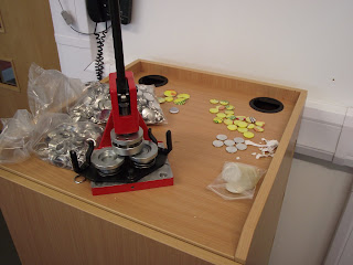
Making Our Pearly Suit: Part 1
So having now been given all the necessary materials to make the badges as well as the suit itself we were able to make a start on putting our suit into production. First of all we had to make the badges for our suit. Below are a couple of photos showing our circle cutter, badge maker, roll of cut out crisp packet circles to make the badges with, your truly doing a bit of work and what the finished badges looked like.
 .
.


 .
.


Monday, 17 May 2010
Creativity and the End User - Essay
Creativity and the End User is very much a theoretical module and is mostly word based, there is little or no design involved in this module at all. For our term one brief for this module we were told to write a 1500 word essay on how the videos of other artists we watched during lessons had inspired us and how we would now adapt our working practise. The artists we looked at included:
Carole Guevin

Katrin Olina

Philippe Starck

Carole Guevin
Katrin Olina
Philippe Starck
Intro To Digital - Technical File (Theory)
 Intro to Digital is the module where we learned how to use design software/ packages such as Adobe Illustrator, Adobe Photoshop and Adobe InDesign.
The brief for this project was to produce a technical file explaining the design tools found within each one of these programmes and how to use them. The technical file also explains about different techniques that can be done using these programmes. At the end of each section I gave ten examples of the work I had created using that specific programme. The technical file was basically a reference guide for using these design programmes. An example of my tech file can be seen below: (Click to enlarge)


Pearly Kings and Queens: Winning!
I am pleased to say that our tutors were very impressed with our suit design as well as the thinking behind it and the creativity that went into it. Therefore my group was one of three groups to win the competition to have our suits put into production. From this week we will begin work on actually creating the suits and updates will be posted on the blog as production gets underway. Once the suit is completed it will be displayed in the University of Huddersfield Degree Show, the University of Huddersfield Library and hopefully the Vivienne Westwood Shop in Manchester. I say hopefully as negotiations are still underway. Updates will be posted.

Pearly Kings and Queens: Designing The Suit
Once we had a theme our group decided to combine the best features from suits that individuals in the group had come up with during concept development. After plenty of discussion we finally came up with a design everyone in the group felt happy with: (Please click to enlarge)


Wednesday, 12 May 2010
Pearly Kings and Queens: Getting A Theme
Once we had established what Pearly Kings and Queens were, we were then told that we would be creating our ow version of a Pearly suit as part of a class competition. There would be three winners of this competition who would get their suit design put into production and displayed at the University Degree Show following which they would be displayed in the University Library.
 Unlike the Pearlies however,we would use badges, like the ones below, rather than buttons for our suits.

We were then given several themes for our suit designs. My group picked renewable energy.Following much discussion and debate decided that we wanted to go with two mini themes within the heading of renewable energy which were solar power and recycling. We decided to cover the solar power idea by spelling out the words solar power on the suit and using badges to create solar panels on the suit. To cover the recycling part we decided to make the badges out of recycled crisp packets.
Unlike the Pearlies however,we would use badges, like the ones below, rather than buttons for our suits.
We were then given several themes for our suit designs. My group picked renewable energy.Following much discussion and debate decided that we wanted to go with two mini themes within the heading of renewable energy which were solar power and recycling. We decided to cover the solar power idea by spelling out the words solar power on the suit and using badges to create solar panels on the suit. To cover the recycling part we decided to make the badges out of recycled crisp packets.
Subscribe to:
Posts (Atom)