
I choose this font as an example of good typography because it is a sans serif typeface and therefore simple, uncluttered and easy to read.

I choose this 'mpeople' example because of its even contrast and bold weight making it clear to read and the use of ligatures between the 'm' and the 'p' giving it a more stylised look.
 This last example on the left was chosen because it shows a good understanding of the weight of the characters and the spaces between them, which helps achieve the twin aesthetic aims of appeal and legibility.
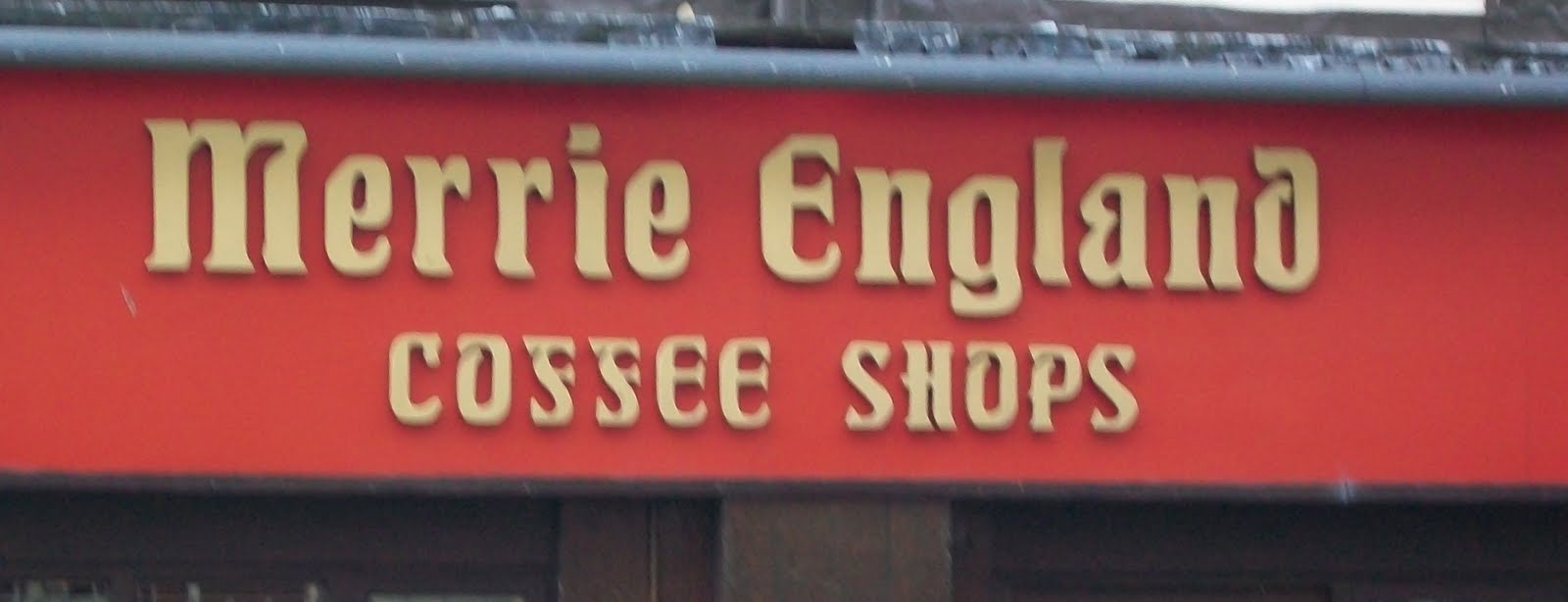 This 'Merrie England' sign was picked as an example of bad typography because it has extensive 'ears', 'spurs' and bracketed serifs that make it hard to read and unappealing.
 This was also picked as an example of bad typography because the drop out type added to the pixelated style of the typeface make legibility difficulty.
This is also a bad example of typography due to the extensive use of ligatures combined with the small size of the text makes the overall spacing a bit uneven and affects legibility slightly.

No comments:
Post a Comment