Carole Guevin

Katrin Olina

Philippe Starck

 Intro to Digital is the module where we learned how to use design software/ packages such as Adobe Illustrator, Adobe Photoshop and Adobe InDesign.


 Unlike the Pearlies however,we would use badges, like the ones below, rather than buttons for our suits.
 day in their various London districts.

 of Gods and fertility designs. Each outfit can have as many as 30,000 buttons on it and can weight as much as 30 kilograms or more.
Source: http://www.historic-uk.com/CultureUK/PearlyKingsQueens.htm


 This last example on the left was chosen because it shows a good understanding of the weight of the characters and the spaces between them, which helps achieve the twin aesthetic aims of appeal and legibility.
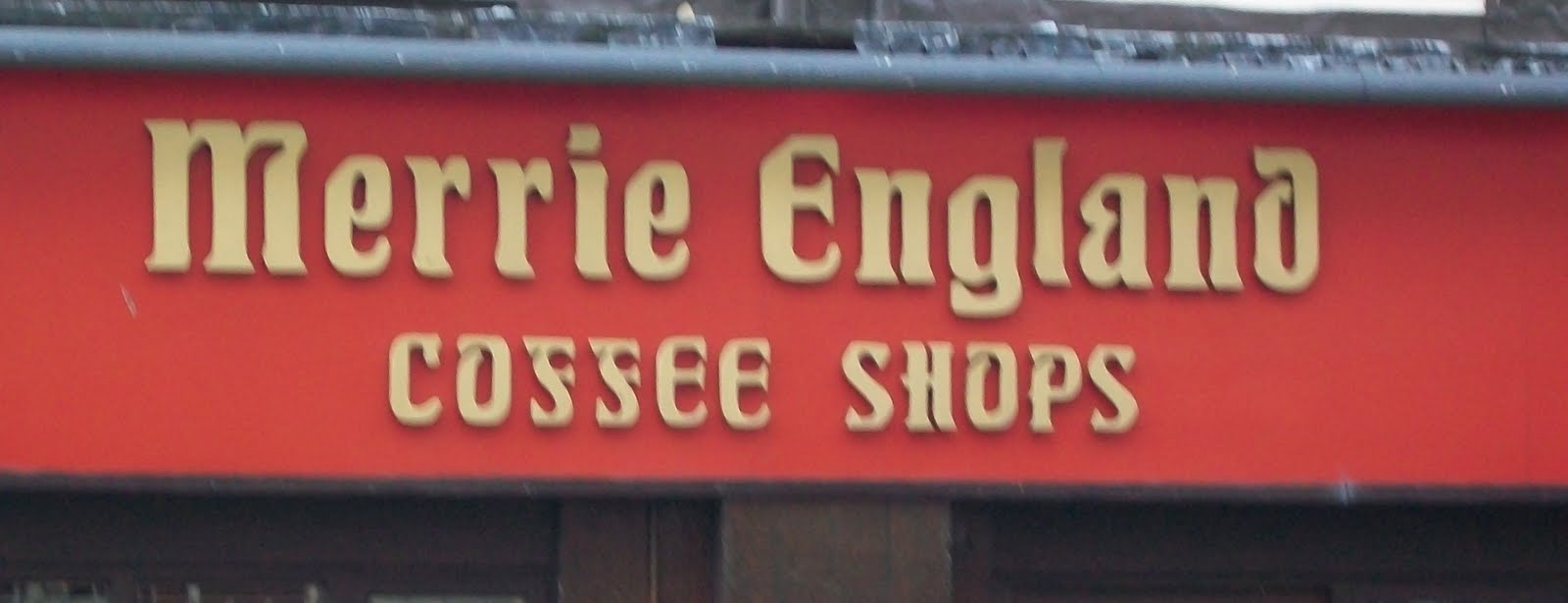 This 'Merrie England' sign was picked as an example of bad typography because it has extensive 'ears', 'spurs' and bracketed serifs that make it hard to read and unappealing.
 This was also picked as an example of bad typography because the drop out type added to the pixelated style of the typeface make legibility difficulty.