Tuesday, 21 September 2010
Personal Work: Illustration
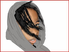
Just a bit of illustration from me. I am not an illustrator by nature but decided to give it a go. Here is a drawing I did before colouring it in in Adobe Illlustrator giving it a mosiac look. I colouredit in using the live paint bucket.


Personal Work: Moderate Drinking 2
I like the first moderate drinking add I did so much and got a good response from people so I decided to do another this time aimed more at men. I used the same techniques as previously.
View it below: (Click to enlarge)

View it below: (Click to enlarge)

Labels:
Adobe Illustrator,
cartoons,
drinkaware,
hand drawn typography
Personal Work: Photography
I love photography and having got a new SLR camera I have been taking pictures whenever I get a chance. These are few I took over the holidays:


Labels:
amateur photography,
Blackpool,
photography
Personal Work: Poster Design
I was asked by the community centre church my mum works for to design for them a simple poster advertising their upcoming thanksgiving dinner.
They want the poster to have a original images but in a clip art style. The also required information about the dinner and event on the poster, as well as their address and the date of the event.
This is the final poster I designed for them that they decided on using: (Click to enlarge)
To create the images A few I drew by hand in Illustrator using the pen tool, others i got off the Internet and manipulated them to create a completely different look from the original. I also used live trace and the live paint bucket to help.
The hardest part was to get all the information onto the poster as I was limited to working at an A4 size. In the end I hand to compromise with them in terms of the amount of text that could be put onto the page along with the images. I cut away all the unnecessary text.
The centre was very pleased with the end product. I don't consider it my best or most artistic piece but it fit their requirements.
They want the poster to have a original images but in a clip art style. The also required information about the dinner and event on the poster, as well as their address and the date of the event.
This is the final poster I designed for them that they decided on using: (Click to enlarge)

To create the images A few I drew by hand in Illustrator using the pen tool, others i got off the Internet and manipulated them to create a completely different look from the original. I also used live trace and the live paint bucket to help.
The hardest part was to get all the information onto the poster as I was limited to working at an A4 size. In the end I hand to compromise with them in terms of the amount of text that could be put onto the page along with the images. I cut away all the unnecessary text.
The centre was very pleased with the end product. I don't consider it my best or most artistic piece but it fit their requirements.
Labels:
Adobe Illustrator,
clip art,
live paint bucket,
live trace,
pen tool
Personal Work: Moderate Drinking
This is a poster advert I designed in my own time showing the perils of drinking beyond your limit.
I decided to do it in a cartoon-esque style so it wouldn't come across as too preachy and would be more friendly to my target audience of teenagers and young adults who consume alcohol.
 I designed it in illustrator entirely by freehand using the pen tool. I spent alot of time getting to learn about the pen tool and all its uses in my first year of university and was keen to get some more practise in. The lower bottom font "know your limits" was done by me by hand before being scanned in and vectorised.
I decided to do the font by hand as the uneven slope of the letters help suggest the drunkenness and disorder that comes with too much drink.
I decided to do it in a cartoon-esque style so it wouldn't come across as too preachy and would be more friendly to my target audience of teenagers and young adults who consume alcohol.
 I designed it in illustrator entirely by freehand using the pen tool. I spent alot of time getting to learn about the pen tool and all its uses in my first year of university and was keen to get some more practise in. The lower bottom font "know your limits" was done by me by hand before being scanned in and vectorised.
I decided to do the font by hand as the uneven slope of the letters help suggest the drunkenness and disorder that comes with too much drink.
Labels:
Adobe Illustrator,
cartoons,
drinkaware,
hand drawn typography,
pen tool
Subscribe to:
Comments (Atom)
